Greatlakes Architectural Millworks
Chicago, IL
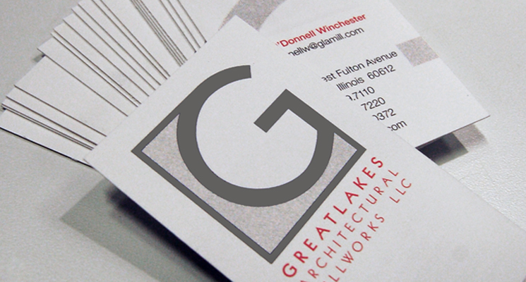
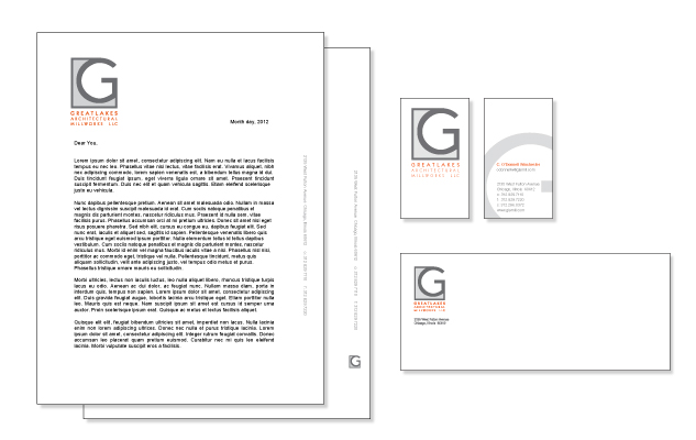
In late 2011, the new owner of Greatlakes Architectural Millworks asked marquardt+ to create a new identity for the company including collateral materials, a brand new website and creative direct photo shoots of completed projects to be used in digital and printed applications.
It was important to Greatlakes that their new identity and website convey who they are as a company and provide a visual legitimacy not previously realized in their collateral material.
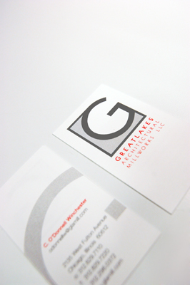
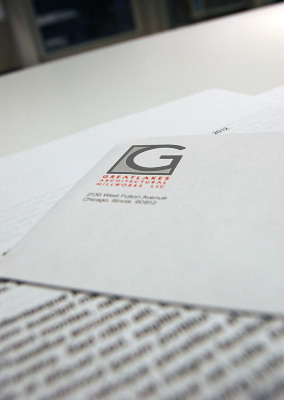
The logo is a capital ‘G’ contained in a square that mimics the feel of having been routed out of a solid surface material. Their full name appears in their new, delicate red-orange brand color and font to again visually elude to millworking while making them stand out against the sea of green brand identity colors found across the millwork community.
